Do you want to know how to optimize your landing page?
Making sure that your landing page has all the right content and triggers is the key to making more sales.
You can write great ad copy and spend money to reach a wide audience and get them to click on an ad. But it won’t mean much if your landing page doesn’t convince them to convert and cinch the deal.
Let’s look at some powerful but tiny tweaks you can make in your landing page to win over more people.

With these small but impactful changes, you’ll see an upspring in conversions. Especially if you use A/B testing and track the impact of different elements.
Make your ad copy and landing page copy similar
A person who’s come to your landing page after clicking an ad needs to see a connection between the ad and your landing page.
One mistake that you should avoid is to create a message on your landing page that is different from your ad.
To keep users from experiencing dissonance, use the same images in your landing page that you used in your ad. Also, drive home the same marketing message through your landing page copy, especially above the fold.
If you’d like to add other information, you can add such content below the fold once users are interested in your business.
Create impactful copy above the fold
The ‘above-the-fold area’ of your landing page is the top half of your webpage that holds all the content a user can see without scrolling down.
This important piece of digital real estate is where you make your first and most important impression. And to make just the right impression, keep the following in mind:
- Add calls to action, attractive headlines, and the most important information above the fold
- Keep it simple and don’t overwhelm users
What’s the most important information that you should convey to your users?
This can be the main benefit that users get from your brand or product – the reason why they should be interested in you. Your above-the-fold space should also tell users exactly what your website is about in a brief glance.
It’s also the space where you place your call to action prominently so that you get users to do something that helps you meet your goals.
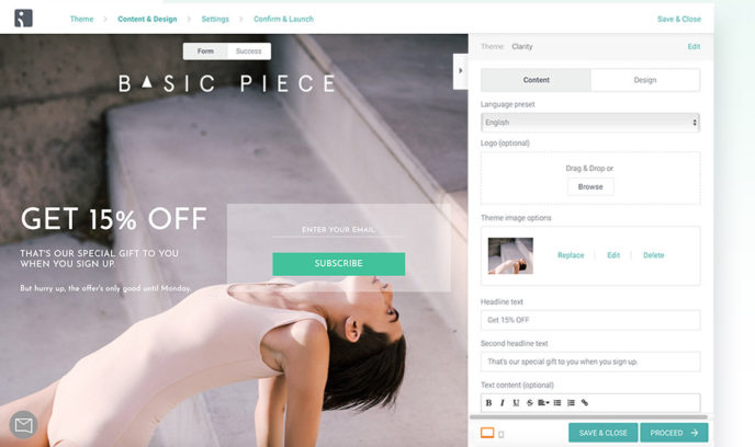
You have to create all this content with just the following elements on your landing page: a headline, a subheadline, a strong hero image, a call to action, and/or a form.
The goal is to create the most impact with the least amount of copy. Keep your above-the-fold area clean and focused and you’re more likely to see conversions.
Drive users to take action
From the perspective of a business or website owner, a landing page needs to appeal to users so that they take action and buy from you, subscribe to your newsletter, or do something that leads to engaging with your business.
And to make this happen, the most important component you should include is a call to action.
Make a clear call to action and position it clearly so that users interact with it. And if your landing page is long and has sales funnel text that keeps readers scrolling downwards, make sure that you repeat your C2A from time to time.
Use contrasting colors
Colors play a critical role in highlighting calls to action and important content on your landing page. When used correctly, the colors you work with will have a psychological effect on your landing page visitors.
To make the best impact, look up complementary colors or contrasting colors for your call to action. You can do this by looking for color wheels online. You’ll find interactive tools that show you colors on opposite sides of the color spectrum. So that when you apply these colors to your landing page in the right places, you’ll get your user’s attention.
For example, red and greens are colors that have high contrast and are on the opposite side of a color wheel. While red and orange are close to each other on the color wheel and when seen together, create a less dramatic effect.
Being aware of color theory to a small degree is enough to help you create an eye-catching landing page. But avoid using too many contrasting colors and focus on ones that support your brand palette. And add them to calls to action and other relevant elements.
Add social proof
Your visitor may arrive on your page after clicking on an ad or social media post. And it’s very likely that this is the first time the user is interacting with your brand. They won’t know enough about you to trust your brand right away.
Building trust right off the bat is challenging but possible to do. The easiest way to win trust is by adding signals of social proof.
The phenomenon of social proof is one where people do something because they see other people carrying out a particular action. When people see a product with many ratings and reviews, they’ll feel comfortable buying a product that other people like.
Adding social proof to your landing page will create a positive impression of your business from the get-go. Here are a few simple ways you can include social proof on your landing page:
- Mention the number of products sold or the number of customers using your product
- Add testimonials by featuring quotes and pictures by real customers
- Place badges for ISI certifications, payment gateway integrations, and membership with an industry body
- Showcase awards your business has won and mentions on recognized publications
Such additions go a long way towards building trust almost immediately.
Capture exiting users’ information
If your landing page content isn’t relevant to the site visitor right then, they’re going to close the window and never return.
One way to capture your user’s attention and email before they leave is by using optin popup form. Set up an optin popup so that it’s triggered when it detects an exit-intent i.e. your user is moving their mouse to close the window or switch pages.
You can offer a lead magnet and encourage users to sign up to get updates, offers, and other benefits. When you have your users’ information, you can nurture them into paying customers at a later date.
Leverage the fear of missing out
If you want to compel users to take action right away, then you need to create urgency and the Fear of Missing Out (FOMO).
There are several ways to do this:
- Create a special offer on your landing page and add a time limit that expires soon.
- Use a countdown timer to add a visual aspect that reinforces the limited time for which the offer will be available
- Use a social proof app that sends notifications to users that other people are buying and that your product stock is running out
Small additions like these will induce users to make a faster decision especially if you’re offering a great deal that your audience will benefit from.
Over to you
Making a few changes to your landing page can mean the difference between growth and stagnation in your business.
Along with the steps given here, be sure to do split testing on each element to tweak the impact of your content.
As you get better results, you’ll be able to shape your landing page to grow your business fast.
–
Syed Balkhi is an award-winning entrepreneur and online marketing expert. He is the co-founder of OptinMonster, WPBeginner, MonsterInsights, and WPForms.