Blogging is the cornerstone of content marketing today.
With high-quality blog posts, you can bring traffic to your website and get higher search engine rankings.
But the real test of your blog’s effectiveness is whether it can generate sales or not.
You could be making small but impactful design mistakes on your blog that are keeping you from generating revenue.
In this post, we’ll look at how to design your blog site so that it creates trust and compels people to buy your product.
1. Make your blog easy to read
People who land on your blog are going to skim it first to see if it’s interesting to them.
If your post uses small font and isn’t formatted properly, your readers will quickly leave it and find another site.
Make sure that you use short paragraphs with a maximum of four lines in each one. Use bullet points to break down a series of steps or ideas.
And add a subheading to each section of your post so that readers know what your post is about with just a glance.
2. Include pictures and videos
Seeing pictures and videos is far more memorable than just reading text. Pictures and videos also provide context that supports your ideas.
Another reason why adding graphics, pictures, and videos matters is that it breaks up a long article. By making your content easier to consume with the help of visuals, your readers will recall your blog more easily.
Other ways to add imagery to your content are by using emojis (but sparsely) and including gifs and memes whenever it’s appropriate.
People prefer casual modes of communication today. And when done right, the pictures in your post will set the mood for your blog.
3. Make your navigation simple
Navigation is one of the critical parts of any blog.
When a user has a goal, they should be able to look at your home menu or submenus and figure out what to click on right away.
Make sure that every page on your blog has links that go back to the home page and help readers navigate to other posts too.
If a user clicks on a link and doesn’t find what they need, they’ll leave your site and never return. So, work on your blog’s navigation and add a search tool to every page so that readers can find exactly what they need.
4. Give readers the ability to subscribe to your blog posts
Adding an optin popup to your blog will help you connect with readers directly. Many readers leave a blog with the intent to return again. But people often forget the URL or get distracted.
To avoid this, add an optin popup form to your website. And also create subscription forms and place them in many places around your blog.
Your blog readers will subscribe to your newsletter and you can send them updates whenever you post something new.
5. Choose a brand color pallet
Another important design principle is to do choose a fixed color pallet for your blog. Many people who are new to website building get overexcited and use far too many colors for their blog.
This only serves to distract your audience and makes your blog look poorly designed.
Every website needs a fixed number of colors that are repeated throughout. You need the main brand color, an accent color, a dark shade, and one or two others to compose your brand pallet.
I suggest that you use an AI color pallet generator that automatically pairs together colors that look good.
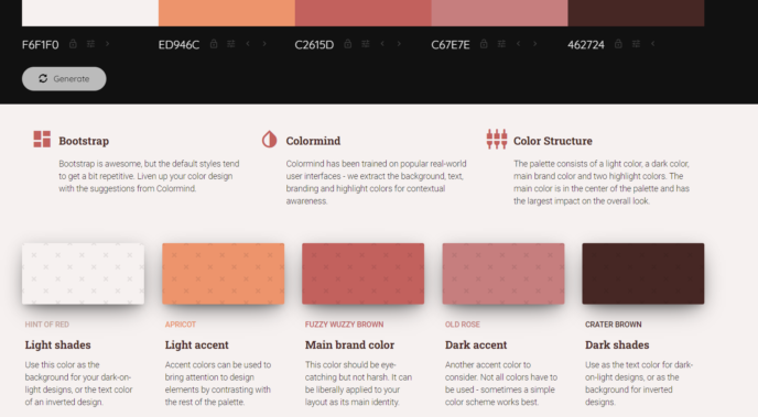
Colormind.io is an AI color pallet generator you can use for your blog design
Then stick to this pallet when designing your website. The end result is that your website will look professionally made even if you’re new to website building.
6. Keep it simple and straightforward
The most professional and attractive blogs are ones that are simple. They avoid too many colors, images, and don’t use complicated layouts for their blogs.
You shouldn’t worry about your blog looking too plain. Instead, actively make sure that it doesn’t look cluttered with too many links, images, or varied font styles.
The same principles apply to your writing style too. Use a conversational tone, just like you would when chatting with a friend.
When you keep things simple and tidy, people find it easy to read your content and your blog will look more appealing to readers.
7. Choose the right content widths
A major secret to good blog design is establishing the right content width or widths.
You want to avoid choosing a 100% content width for your posts as that will make your content appear from edge to edge on a device. It’s not a good look and is very uncomfortable for people to read.
It’s important to set a narrower content width for your main content. And there’s no single answer as to what dimensions you should choose for your blog.
Factors like what devices your readers use will matter when it comes to choosing the right content widths. Your best option is to experiment and check that the width you set for your blog content looks appealing on all devices.
8. Stick to two fonts
The last tip is to use a font-generator tool and select just two fonts for your entire blog. If you’re an expert in web design and typography, then you can easily select more fonts and apply them with great effect.
Otherwise, pick two fonts, one for titles and one for body text. And keep them consistent across your site. Although it may seem too simple, sticking to a limited font set will make your blog appear professional.
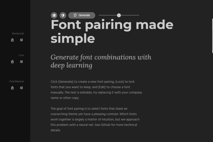
A font generator will pair together cohesive styles
Conclusion
The design principles mentioned here will quickly make your site look amazing. But you always need to experiment to figure out what works best for your own website.
Keep experimenting to create a gorgeous blog and you’ll reduce bounce rates and increase traffic to your website.
—
Syed Balkhi is an award-winning entrepreneur and online marketing expert. He is the co-founder of OptinMonster, WPBeginner, MonsterInsights, and WPForms.