As much as people like to say that they enjoy having the freedom to choose, the fact of the matter is that having too many choices can be overwhelming and paralyzing. This is indeed one of the biggest reasons why Apple has been so successful over the last several years. You’re offered a limited selection that should cover the needs of most customers, rather than inundating them with dozens of models to choose from.
The exact same kind of philosophy needs to be applied to your web design and to your Internet marketing efforts. If someone arrives on your sales page and they’re offered far too many ways to leave that sales page, you’re probably going to see your conversion rate suffer. That’s why some of the most successful sales pages really only have featured link: the “buy” button.
Of course, you don’t have to restrict your visitors to just one choice all the time, but you should have a pretty clear and obvious call to action available to them at any time.
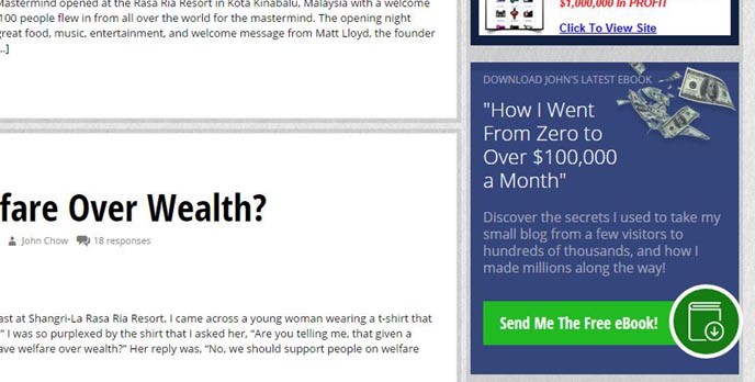

Let’s start with a prime example right here on John Chow dot Com. If you take a look at the sidebar, this promo spot for John’s free e-book features quite prominently.
Sure, readers are encouraged to browse their way through the blog’s archives and check out some of the other material, but you’ll notice the e-book banner follows them everywhere. It’s a pretty important component to this blog and it is highlighted accordingly.
Even when you are guest blogging on someone else’s site, you can take advantage of using a call to action. This is particularly true if the blog provides an author bio box at the end of each post. Yes, you want to use the bio to tell readers a little bit about yourself, but you also want to indicate what you want them to do. Visit your blog? Sign up for your services? Hire you as a designer?
This mindset of not-so-subtly encouraging visitors to complete certain actions isn’t restricted to the world of blogging and sales pages either. People want to have choice, but they need to know what their choices are. In the case of social media, you can similarly leverage the bio section of your profile.
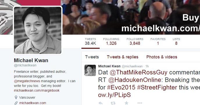
For example, you can see my Twitter profile above. I tell people that I am a freelance writer, but I also tell them I am available for hire. And I also indicate I have a book that I’d like for them to purchase. This gives them options and provides a couple clear calls to action. To drive the point home even further, I’m taking advantage of the header image on my Twitter profile page to showcase my book too.
By extension, you can take a similar approach to just about all your social media profiles and pages, including Facebook, Pinterest and Instagram. You’ll notice that many of the major brands have done exactly that, slightly altering their bios and profiles whenever they have something specific they’d like to promote. In the case of Instagram, this is particularly powerful because external hyperlinks are not allowed in the image descriptions.
It’s a fine line to tread between offering a helpful call to action and being an obnoxious over-promoter, but it’s a line that you need to tread if you want to be successful making money online.