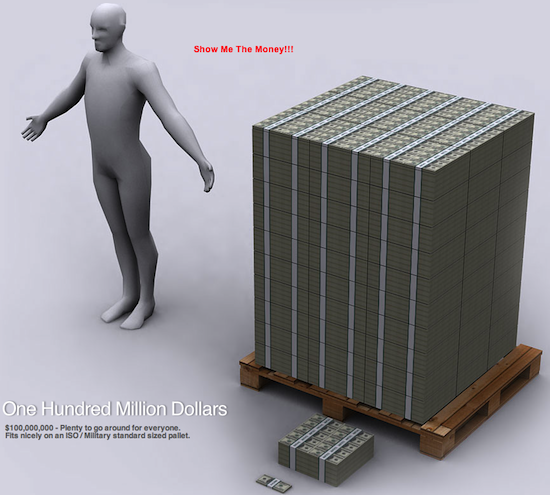
I came across an interesting site call WTFnoway.com that had an infographic showing the visualization of the debt of the Untied States of America.
Starting with the $100 bill, WTFnoway gives you an idea on how many stacks of bills it takes to make various amounts. They show what $10,000 looks like, then $1 million, and continued from there. Below is a Visualization of what $100 million look like in $100 dominations. It fits nicely on an ISO / Military standard sized pallet.
Now, the United States owes a lot more than $100 million. Heck, the deficit alone is going to $1.7 trillion this year and the national debt is going to top $15 trillion by Christmas 2011 (assuming the debt ceiling increase goes through).
As big and scary as that sound, the number pails in comparison to the $114.5 trillion US unfunded liabilities. This is the amount of money the US government knows it doesn’t have to fully fund Medicare, social security, military, civil servant pensions, and all the other good stuff we come to expect from living in the land of the debt.
What does $114.5 trillion look like? Go to WTFnoway to find out.

