As consumer, we like to think that we want to have as many options available to us as possible. The assumption is that when there is a greater variety of products and services, it’s more likely that we’ll find the solution that best addresses our particular needs and preferences. Not everyone wants a black sedan. Some people want a red hatchback or a silver SUV, right?
The reality is that this is only partly true. Consumers want to feel like they have options and they’re in control of the situation. And yes, you may ultimately want to offer your customers some range of choice so that a suitable solution can be had. However, when you’re trying to get your foot in the door and land that first sale, too many options simply result in a ton of confusion and distraction. If a customer doesn’t know what to do or what to choose, he could just leave.
One of the first places where you’ll want to think about this is with your homepage. While the concept is most applicable in the sphere of e-commerce, both in terms of selling products and services, it can be just as applicable to other types of sites too. What do you want the visitor to do.
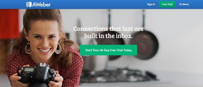
A great example of this is the homepage for AWeber, one of the most popular email marketing platforms on the Internet today. Sure, the service comes with a slew of different tools and features and there’s a lot you can do with those email newsletters. AWeber could have focused on the educational model and tried to teach or convince potential customers to choose AWeber… but that’s not what they did at all.
Looking at the homepage, it becomes painfully obvious that all they want you to do is to sign up for a free trial. The green button at the top stands out from the “sign-in” and “menu” links that flank it on either side. There’s a large header image above the fold, but once again, a “free trial” button is placed right in the middle, using the same green. The message echoes. The choice is clear.
But this philosophy goes well beyond just the homepage. Let’s look at the pricing page for AWeber too.
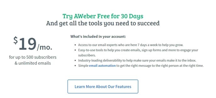
Even if a website visitor were to dodge those first two green buttons on the homepage and clicked through the menu to the pricing page, they’ll be hit once again by the same core messaging and the same call to action: sign up for a free trial. Above the fold, aside from the actual image used, the layout is much the same. The two green buttons persist.
Immediately below the fold, depending on your screen resolution, you’ll get a quick outline of what you get for the cheapest AWeber plan (for up to 500 subscribers). There’s a button to learn more about the features, but there’s the same green color being used for a message to “Try AWeber Free for 30 Days” again. But they don’t stop there either.
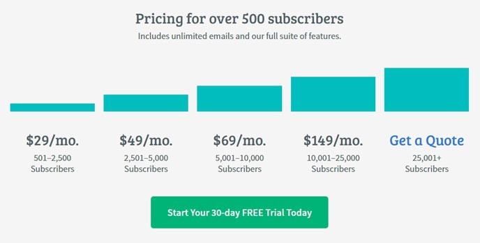
Scroll a little further down the page and you’re shown the different pricing plans available for when you have over 500 subscribers. Yes, you can see how much it costs depending on how many subscribers you have, but once again, there’s no “buy now” or “subscribe now” button under each plan. Instead, there’s just one big green button to “start your 30-day free trial today.”
Again, the choice is painfully obvious and clear. That’s exactly the kind of strategy you need to take with your own website. If you try to feature too many navigation paths or too many options at the same time, the visitor just gets confused and you start splitting your traffic. Decide what it is that you want the customer to do and make it as easy as possible for him to do it.