The sole aim of starting a blog is to solve problems.
But that’s too vague, because we need to identify the need of our target audience, our readers and everyone that comes to our blog. The truth is that your blog isn’t for everyone.
Once you can establish this truth, half the battle of converting the right prospects is won. So, how do you ensure that your blog is converting people?
Trust me, it takes a lot of tweaking and split testing to get it right. But there are simple steps you can take to get the most out of your blog. Listed below are 4 things you can do to get people to do whatever (good) you want them to do:
1.      Have a can-do mindset
Are you surprised that I started with this? Well, you’ve to understand that a can-do mindset is the foundation of great blogs. When you’re confident in yourself, you’ll be able to think straight and create a plan for your design.
If you don’t believe you can make it, nothing in this world can help you. Before you can convert people, they’ve to see the energy and life emanating from you. When you write, there will be so much fire in your words.
You’re not trying to impress anyone with your blog, but to help them achieve their goals and in turn, you make the world a much better place because you’re in it.
Most bloggers have resolved in their minds that they can never move beyond where they’re right now. Converting readers into customers isn’t in their Dictionary.
Just because your blog is not getting up to 100 readers per day doesn’t mean you’re a failure already. If you work smarter and wear a positive outlook at all times, that same energy would spur into your blogging activities and your readers will start listening to you.
2.      Use catchy call to action designs   
The second simple way to designing a blog that converts readers is to use catchy CTA designs.
For instance, the typical and not-so-good text on your subscription box says “submit.â€
If you want to build your email list faster or get people to visit your webpage, then don’t use that default.
You’ve got to change it to something catchy, benefit-driven and please, don’t use hype or trick.
You can still be honest with your call-to-action designs, and at the same time persuade the right people to respond to your offers. In order to choose a suitable CTA design, your give away product would determine it.
For instance, if you want people to download your e-book, you could use any of these designs for your button: “Download Here, Send My Ebook, Click To Download, Send To My Inbox etc.â€
3.      Make your post titles clear
Using free wordpress theme isn’t a bad thing, but the challenge lies in making the layout of the blog and texts suitable and clear to your readers. Whenever I install a free theme, the first thing I’d do is go to Appearance > Editor and edit the Cascading Style Sheet (CSS).
This sheet is what controls the text styles: color, face, position, size, decoration et al.
Be careful not to edit your CSS sheet by yourself if you don’t have the basic knowledge of it. Get the services of a web designer – they can help you achieve a much better blog design within 30 minutes.
Basically, you’d want your post title to be Bolder, Clearer and Different from the text on the content. Also, your links have to be visible.
You and I know that readers are already accustomed to blue underlined links. If your theme doesn’t show this, you can always make it better by tweaking the Cascading Style Sheet (style.css).
4.      Activate 2-3 social media buttons

Social signals are one of the ranking factors released by Google earlier this year. If you want to experience a community and in turn increase your search rankings and traffic, then you’ve to engage your readers.
Wise bloggers understands that activating Facebook, Twitter, LinkedIn, Google+, StumbleUpon, Digg and Reddit share buttons won’t make any difference no matter the value you provide your audience.
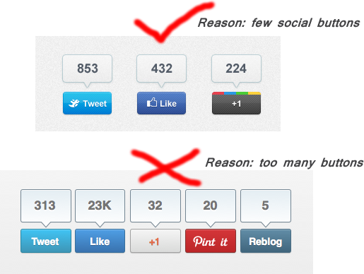
The best thing to do is to activate Google+, Facebook and Twitter share buttons. In fact, I’ve seen authority blogs that have just the Google+ and Facebook or interchanged it with Twitter.
Remember that simplicity is the best language your audience understands. When you design a blog for your business, don’t go overboard with more than 3 share buttons. If you choose to use just one share button, which one do I recommend – Google plus.
Blog design takeaway
Always remember that a beautiful looking blog without good content to engage readers is a total waste of time. On the other hand, when you’re able to provide epic content regularly, and also give attention to quality design, you’ll eventually build a profitable blog.
What is your tip for designing a blog that converts readers to subscribers/customers? Drop your comment below and let’s meet at the top!