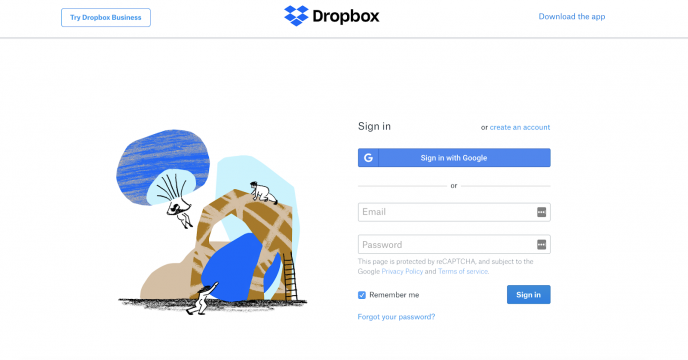
When you start a business, you put a lot of thought into your conversion strategy and how you’ll garner enough customers to build ROI. But have you put the same effort into creating optimized lead capture forms?
Too many marketers overlook the importance of a well-designed contact form and how it affects their conversions. A staggering 81 percent of users have abandoned a form after beginning to fill it out, which means not enough businesses are doing their job to cater to their website visitors.
To move customers through the sales funnel, you need to gain their trust, and building an email list is the perfect first step. However, converting visitors to subscribers is challenging when you don’t create optimized lead capture forms.
For any business to generate leads and build ROI, it needs to provide a smooth UX for the visitor. Forms that fail to cater to the consumer push them to bounce from your website and never return.
So, if you want to boost your lead capture form conversions, here are five tips to help you get started.
Use a Single-Column Format
A recurring theme of successful lead forms is that they don’t overwhelm the user. Remember, you want to provide a pleasant experience for the user from start to finish so it’s easier to complete.
Opt for a single-column layout in your lead form. They’re simple, minimal, and easier for users to focus on and finish. Users filling out your form will likely be new to your brand, and presenting them with a lot at once might scare them away.

Reduce Form Fields
People don’t have the patience to fill out tons of information about themselves on your website, especially if they’re relatively new. You want to make it as easy as possible to grab their contact information.
So, you need to reduce the number of fields in your form and asking only for essential information. HubSpot found that minimizing the number of form fields from four to three increased their lead conversions by a whopping 50 percent. Even the simplest tweak can make all the difference in how your forms perform with visitors.
Eliminate any confusion your form might present to users. Specify which fields are required and which are optional. If some fields need more context or explanation, make sure to provide it. This makes it easier for users to move through your form without issue, thus increasing your conversions.
Don’t Ask for Too Much
Visitors who are new to your website need to build trust with your brand before they can move through the conversion funnel. People aren’t keen to share their personal information with just anyone, so you need to make sure they feel comfortable while on your site.
Avoid asking for too much information in your form. This means asking only for what’s necessary and nothing more. Many businesses make the mistake of creating a form that’s invasive to new visitors and scares them away.
You don’t need home addresses, phone numbers, and birthdays right away, so leave it out of your lead form. In the beginning, the most you should expect from users is their email address and name.
Include Social Proof
When someone signs up for an email list, it means they trust that brand enough to hand over their information and be contacted later. But to get to that point, you need to build brand credibility with your audience, and you can do that with social proof.
Social proof is a psychology trick that marketers use to reel in site visitors and gain their trust. By showing users that many others like them are performing certain actions, it’ll convince them to do the same.
For example, some ecommerce stores display live buying activity on their website so users can see the purchases happening in real-time. You can do this by using a social proof tool like TrustPulse.
Other popular forms of social proof include:
Social proof is important for any marketing strategy because it builds credibility between your brand and its audience. Users can’t navigate your lead form and move through the conversion funnel if they don’t trust your brand first. So, you need to make sure to establish key points of trust on your website in the form of social proof.
Optimize Your Call-to-Action
Your call-to-action needs to reel in visitors and entice them to click through. Users are used to the common CTA catchphrases overused by many, including:
While these verbs are straightforward, they don’t encourage visitors to take action because they’re boring. You need to harness your creativity in all areas of your marketing to build your customer base, and that includes your CTAs.
Use relevant, targeted keywords in your CTAs to grab users’ attention and convince them to convert. If you have a specific offer or deal, you can mention that in the text.
Netflix used specificity in their CTA text to collect visitors’ email addresses and provide them with a 30-day free trial:

Your Turn
Whether you want to grow your blog or boost sales, every marketer should know how to create a lead form that converts visitors into subscribers. They lay the foundation for your customer base and are an important part of your business’ success. You need to prioritize the UX you provide on your site to ensure you cater to user needs, and this includes your contact forms. How will you increase your lead capture form conversions?
Syed Balkhi is an award-winning entrepreneur and online marketing expert. He is the co-founder of OptinMonster, WPBeginner, MonsterInsights, and WPForms.