How many times have you visit a website, a blog or even an ecommerce site and had a popup window appear with a special offer or trying to get you to enter your email address? It probably happens at least once per day.
The reason why you are seeing so many sites have such call to actions in place, is because they work extremely well.
While the concept of a popup window might seem annoying to site visitors, most sites will have tracking and display settings in place so they will only appear once every month or so. If they were to appear every time you went to the same site, that would definitely be annoying.
However, industry stats have proven time and time again that popup windows and call to actions work extremely well–which is why websites and ecommerce businesses continue to use them.
To help you understand why such methods are ideal for ecommerce sites and blogs of all sizes, today we will be highlighting three different sites and the way they are using such methods to increase conversions, leads and sales on their site.

3 Examples of eCommerce Stores and Websites Using Popups
If you take some time to start visiting random ecommerce sites and online stores, you will likely discover the many different and creative ways popups are being used.
The most common popups will have call to actions in reference to:
- Giveaways and prizes
- Immediate discounts and coupons
- Collection of data through email and phone
- Interactive popups with new site visitors and sales
We will now showcase a few of the working methods through the site examples below.
Coupons and Interactive PopUps
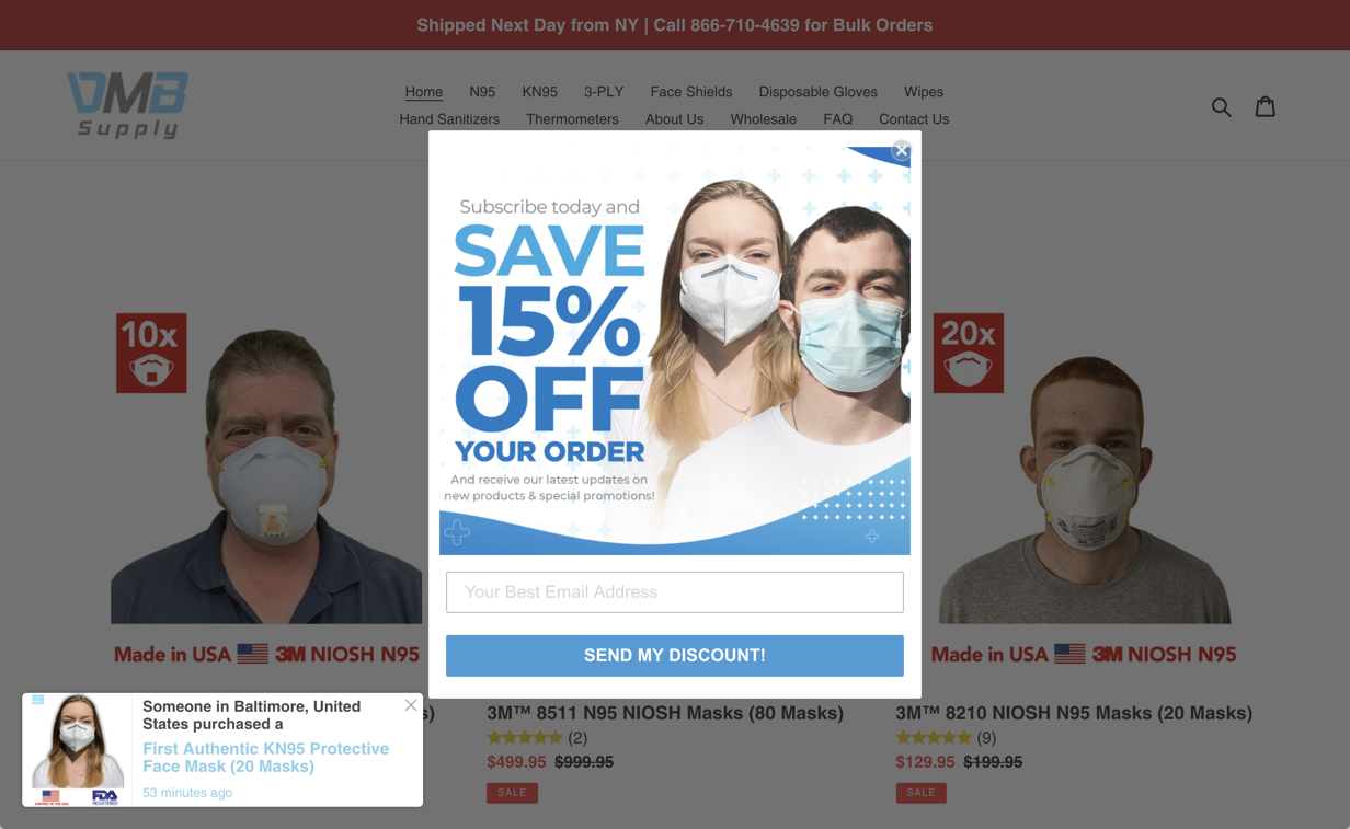
In our first example, we can take a look at DMBSupply and see that they have two different forms of popups on their site to increase sales on masks and other PPE supplies.
The first being the in your face display, which offers a 15% discount off your first order. Of the many different ways to get users to act on your popup, giving away a quick freebie or discount coupon works well. All it takes is for the end user to submit their email to gain access to the coupon, and even if they end up placing an order, they will still be on your mailing list for future reach out.
You will also notice the site has an additional interactive popup on the bottom left corner of the page. This one is great because it shows when the last time an order was placed on the site, and what was purchased. This type of popup is great for displaying it’s a real site and that people are actually ordering from it.

Giveaways and Special Bonuses
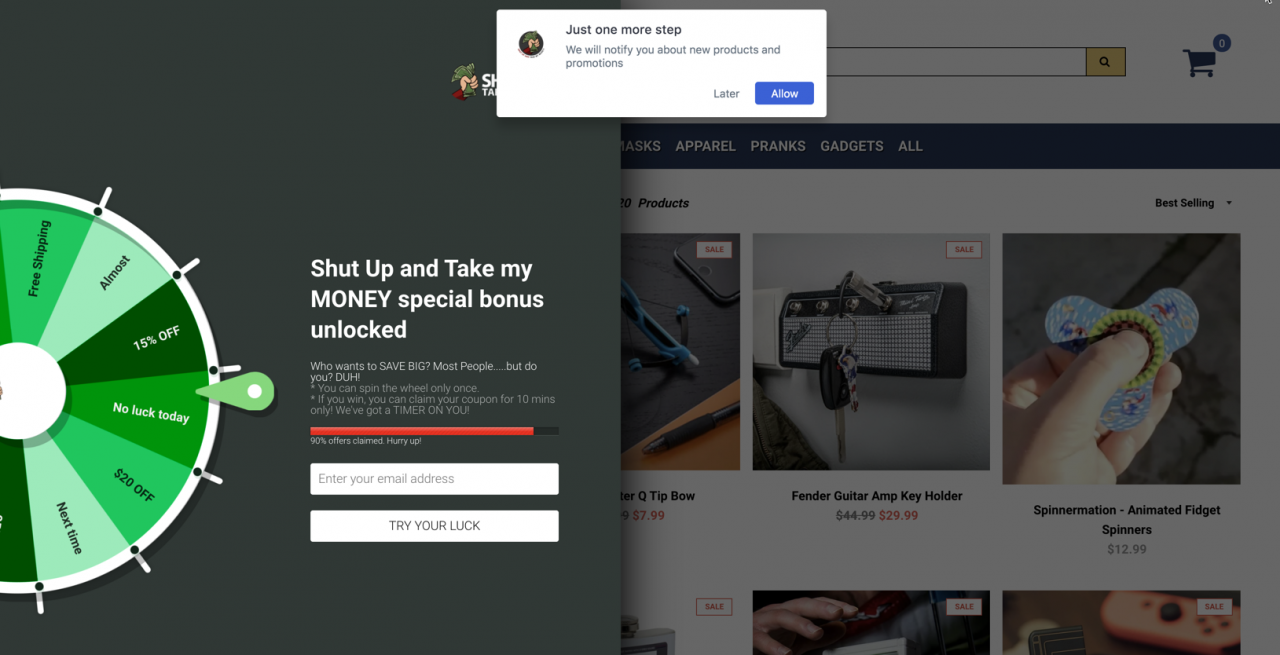
Next, we can take a look at a famous website and blog, which has also turned into an ecommerce site of it’s own. Shut Up and Take My Money is a resource site that highlights different and unique items to purchase online. Thousands of people are visiting the blog section of this site daily, and many of them are sent over to the ecommerce section of the site as well.
When visiting their online store, visitors will have the opportunities to play their free spin wheel game and will get a chance to get their hands on a nice selection of coupons. This spin wheel method works extremely well, as it’s more interactive and fun, while also giving the end user a chance to win big.
The same method applies here as in the previous popup example. Enter your email address, join the mailing list and then be rewarded with a discount code.

Brand Loyalty and Store Gift Cards
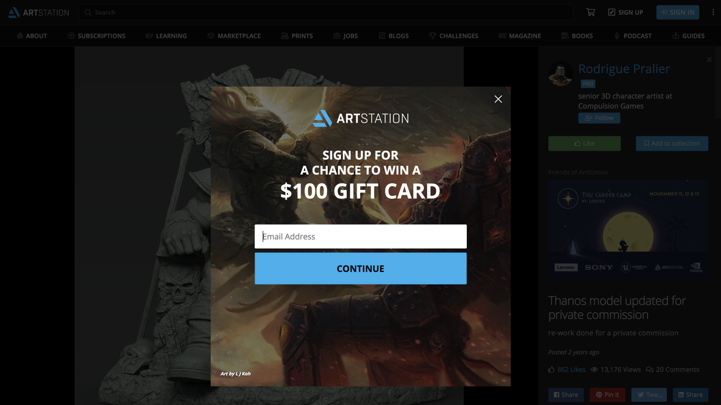
Any type of online community where members share the same interest or have the same expertise and skills, is always great for the brand loyalty and growth. A perfect example of this can be seen at ArtStation, which is an online community and marketplace for artists of all types.
When visiting the site, users are approached with an opportunity to win a $100 gift card. However, unlike the other discount and promotion popups already mentioned, this one starts off with an email address and then requests a phone number as well. If you are an active artist or contributor to the site, this would likely be something almost every member on the site would act upon.
This not only allows for better contact information from the site and brand, in order to stay in touch with their audience, but it also provides a gift card that would help increase in-house sales.

Each of the examples above are unique in their own way, but also caters to the interests and needs of their audience as well. This is also a great takeaway for site owners to realize that not all popups and call to actions will work in the same way.
Are you still not using popups on your site?
If you aren’t using any popup windows on your site to increase ecommerce leads and sales, we don’t blame you. It’s definitely something that you need to feel comfortable with, and at least test with a sub-set of your audience before going live to all audiences.
The good news is, if you are going to be using any of the top popup solutions, these modifications can all be made in a few clicks. This will also allow you to see how many people saw your call to actions, and how many acted on them as well.
After reading through the article and seeing the examples above, we recommend you at least try and start running some lead generation pops on your site and seeing how they perform. Worth case scenario, it’s a quick test and you can remove them from your site.
Happy testing!
