Despite the innumerable assertions to the contrary, people really do like to be told what to do. It can be much more direct in nature, like how you’re supposed to come to a complete stop when you see a stop sign at an intersection. It can also be a lot more subtle, like how every IKEA store is designed so that you have to walk through the entirety of the store in a maze-like fashion before you actually get to the section you came to see. Okay, maybe that last example isn’t exactly all that subtle, but you get the idea.
Those are the rules, instructions, directions and suggestions offered in a real world environment, not so gently guiding people in the direction that a company like IKEA wants you to go. The thing is that the exact same philosophy can be just as easily applied to the online world with blogs, websites and landing pages. And just like how IKEA will gently remind you of this special or that on multiple occasions — the sale signage is visible at the entrance, partway through the store, in the warehouse section, and just before the checkout, for instance — you can do exactly the same thing with your website or blog too.
The point here is that while you want to provide your customers, readers and visitors with a clear and obvious call to action on your site, you don’t have to feel like you can only reference or promote this call to action a single time on your site. You can do it again and again, as long as you do so in a manner that doesn’t come off as being too pushy or offensive.

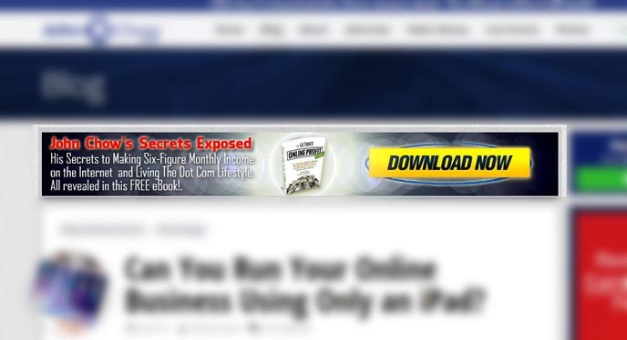
You might have noticed that there is a banner near the top of this blog that encourages readers to download the free ebook that John wrote about making money on the Internet. It’s pretty clear that John wants you to get and read this ebook, so he put that banner up there to tell you that.

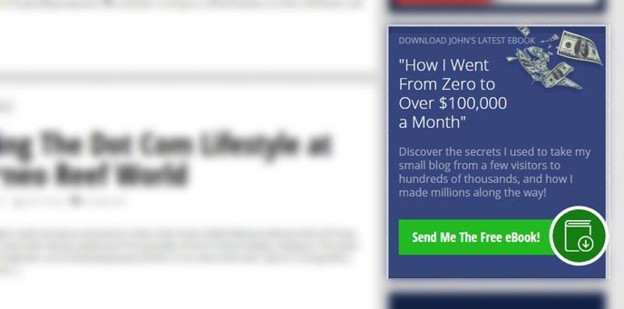
But what’s this? There’s another block along the right sidebar that is effectively promoting the same free ebook. The difference is that this ad block, if you can call it that, takes on a different design and thus may able to overcome the common problem of ad blindness on the Internet.

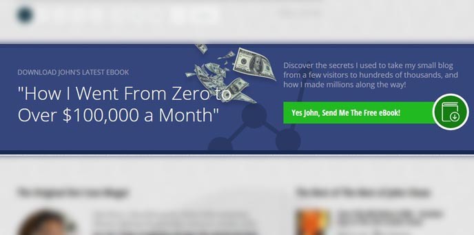
Scroll a little further down the page and you’ll once again find yet another banner once again promoting the same ebook. There are no fewer than three different instances (sometimes more!) on this blog where readers are encouraged to download this free ebook–and you really should read it.
What does this prove or what is the point that I’m trying to illustrate? Part of the challenge that you’ll need to overcome when making money online is getting noticed. And even when you get people to arrive on your blog, landing page, or website, you want them to fulfill your call to action, whatever that may be.
Particularly in the case of a blog like this where a single post or page can take up quite a bit of vertical space, a visitor can easily “miss” the “main” banner or mechanism with your call to action. They scroll just a little bit and it disappears. That’s why it’s not such a bad idea to have a call to action above the fold, somewhere in the middle, and somewhere toward the bottom. This way, you have a better chance that one of these calls to action (even if they are promoting the same thing) will get noticed, clicked, and completed.
This is true for blogs like this and it is perhaps even more effective with the omnipresent long form sales letter. There’s a reason why you’ll see the “buy now” button more than once on most of these kinds of sales page. There may be only be one action being called, but it’s being called on multiple occasions.
