Lead generation is the core activity of any business’s digital marketing strategy. Cultivating leads allows you to nurture the people who are interested in your products to become paying customers.
Your profitability rests on lead generation which makes the gateway to creating leads, i.e. lead generation forms, a serious priority.
In this post, we’re going to look at and break down some interesting lead generation forms I’ve found online. Seeing real-life examples will help you get a better idea than if I made you a post with dos and don’ts.
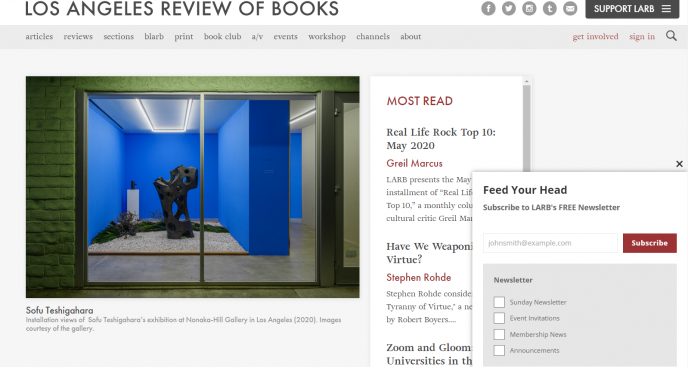
To start with, here’s a simple lead generation form by the Los Angeles Review of Books website. The site itself is informative. However, the lead generation form could be improved. At present, it matches the overall website color scheme and doesn’t stand out as much as it could.
The text copy could also convey more information that compels readers to sign up.
In the sections to follow, we’re going to look at some awesome examples of lead gen forms that you should emulate. We’ll address what works so that you can take notes and learn how to boost conversions on your own site. Here we go!
The Essential Lead Gen Form
A large number of websites do not use optin forms or lead generation forms at all! These websites are letting potential customers slip through their fingers. Building a lead capturing form in the style of an optin popup will help you acquire an email list to further nurture your audience.
From the introduction, we’ve seen an example of a lead generation form for a book review site that could use some work. Here’s another example from another book review website, Book Riot, that shows you how you can improve a simple form. Here are some notes to consider:
- There’s a clean design with large and attractive text that tells users what they’ll receive if they sign up to their site.
- It has a lightbox effect that makes the form stand out from the background which is darkened
- The subscribe button has a distinct color that matches the theme and calls the users attention
- It uses text that’s more compelling. The use of an exclamation point and Subscribe Now convey more emotion and is more compelling

Try to create a clean, attractive, lead generation form that clearly tells users why they should sign up with you. You only need to add one field for entering email addresses and you’re good to go.
Forms with Power Words
This example from Copyblogger features the brilliant use of copywriting techniques to capture leads. Here’s what you should notice:
- The main text body is short but conveys the full benefit a subscriber gets in just six words
- It makes use of power words; in this case, the word ‘Free’. It also highlights the power word in a different color
- The subtext provides more information that’s also compelling and more detailed than the main text
- Here, the subscribe button is super specific as it says ‘Teach Me’ rather than the typical ‘Subscribe’

It’s vital to focus on simple, powerful, and informative text in your lead generation forms. Make sure that it’s actually relevant to your users and provides them with precise benefits.
A Full Page Lead Gen Form
It is very appropriate to include the lead generation form from the John Chow website’s front page.
Let’s breakdown everything that it’s doing right that you can follow when building your own lead generation form.
- Using a full page lead generation form is an obvious eye-catcher. You can use images and text to their full advantage
- There are three short and succinct bullet points that explain real and actionable benefits
- It uses power words and the button also features actionable text
- The subtext with the ‘lock’ symbol and ‘No credit card required’ immediately conveys security and safety

Content Upgrade
A content upgrade takes lead magnets to the next level. Usually, when a website offers a lead magnet or creates an optin form, the form is the same on all pages.
What a content upgrade does is that it offers tailored lead generation forms for different pages or content categories on your site.
While this seems challenging, it’s also highly rewarding. You’ll see higher conversions because the lead magnet offered is directly related to what readers are already looking at on your blog.
Lifehack uses this method extremely well. It has different lead generation forms for different categories of topics.
An assessment popup appears when you’re exploring psychology related posts.

You’ll find time management forms if you’re looking at posts for productivity.

Creating content upgrades is a more personalized approach to lead generation. It’s also a means to segment your email list as you’ll be able to group readers according to their interests.
Social Proof in a Lead Gen Form
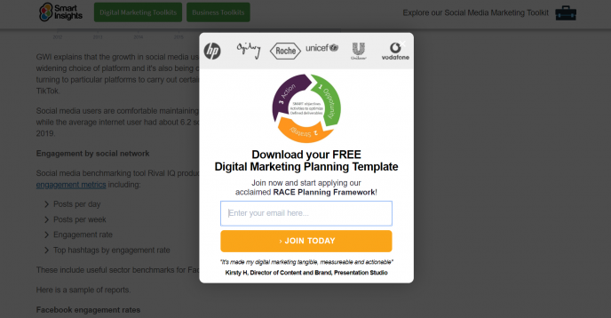
Next is a fantastic lead generation form by Smart Insights. It’s great because it uses a graphic that reflects what it does – providing information.
The text is very specific and is clearly meant for a knowledgeable marketing expert. However, what makes this lead capturing form stand out is the use of logos of its clients in the form.
It’s a clear statement that this is a respected information base that serves high-level audiences. By featuring the businesses it works with, it creates social proof and instantly conveys authenticity.
Using Statistics
It’s well known that statistics and facts go a long way in copywriting. In this form by Sprout Social, you can see how the main text highlights an interesting fact to their audience.
The form also has subtext to convey other information, namely that you can download a guide when you subscribe and that you’ll gain a clear edge over your competition.
Another way it’s different is that it’s making use of a different position when compared to the other forms we’ve seen so far.

‘Coming Soon’ Lead Gen Forms
If you’re launching a new blog or website in the future, you may put off building a buzz or getting leads until it’s up and running.
But what if you could build leads even while your website is still under construction? That’s what a coming soon page is all about.
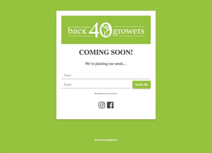
You can create a ‘Coming Soon’ page for your business as your homepage. When readers land on it, they can submit their email to get updates and stay informed on offers and when your site will launch.
A Coming Soon page like the one featured in the image below can be easily built with a WordPress plugin like SeedProd. You can also add social media buttons to send visitors to your social media page while your site is being built.
Conclusion
We’ve looked at several neat and awesome lead generation forms that businesses are using today to create conversions on their site. You can easily build your own lead capturing form by using a WordPress plugin like Formidable Forms.
Lead capturing forms are varied and can make use of different techniques to create more subscribers and convert readers into leads. Use the examples given here as inspiration to build your own winning lead generation form.
—
Syed Balkhi is an award-winning entrepreneur and online marketing expert. He is the co-founder of OptinMonster, WPBeginner, MonsterInsights, and WPForms.