If you’re a marketer, you know the importance of a CTA on your website. It’s one of the most critical elements on your site, that will help you boost your conversions.
This makes it important for businesses to create powerful and irresistible CTAs that compel visitors to click. By doing that, it becomes a lot easier to achieve your goals, irrespective of what your goals are.
This can be to increase your social media followers, boost your sales, grow your email list, or anything else. Without a strong CTA, attracting your visitor’s attention and eloquently guiding them through the sales funnel can be challenging.
But not every marketer knows how to design a powerful CTA that converts. If you’re one of them, you need not worry anymore. In this post, I’ll show you some brilliant call-to-action ideas that your users won’t be able to resist but click.
So let’s get started.
1. Relevance Matters
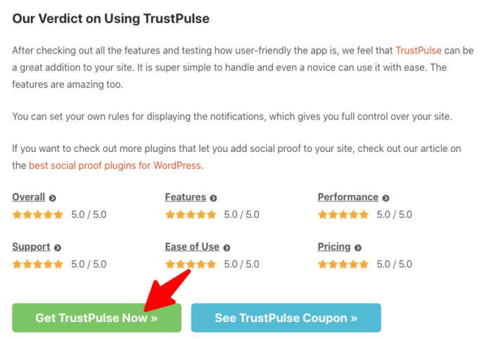
One thing that you need to consider to make your CTA more compelling is its relevance. And this can simply be done by aligning the text in your CTA with the content of the page. For example, say you’re posting a product review and are using a CTA on it.
So instead of using something like ‘Click here’ in your CTA, it can be more effective to write something like ‘Download it Now’, or ‘Try it Now’.
Here’s an example from one of our sites.

Such CTA works because the text in the CTA is directly related to the topic. So your users will know how exactly to get the product that they just read about. This instantly increases their chances of clicking on the CTA to convert.
2. Create Irresistible Offers
One way to create irresistible CTAs is to create irresistible offers. People love offers and are constantly looking for ways to save money when shopping. So use this as an opportunity to boost your clicks.
If you’re not sure how to do that, here’s an example to help you out.

It’s important to remember that most of your visitors don’t read your entire post. What they do instead is to scan it and find anything interesting that might catch their attention.
That’s the reason why this trick works so well. When your users will scan through your content they’ll be immediately drawn by the benefit you’re offering them.
3. Gamify it
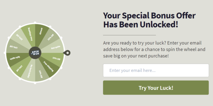
Another brilliant way to make your CTA work is to create excitement, anticipation, and curiosity with it. While this may not be applicable in all instances, if used strategically it can definitely boost your conversions to a great extent.
A good idea for doing that is to gamify your CTAs. You can use them on your landing pages, certain marketing campaigns, etc., to boost user interest. Here’s an example of how you can gamify your CTA.

4. Improve your Design
Many marketers don’t pay much attention to the design of their CTA. But focusing on its design is important because it helps you make your CTA stand out. Your CTA helps you guide your users into the buyer’s journey so that they can eventually take action and convert.
So highlight your CTA with a proper design. Make it big enough to attract your user’s attention. But be cautious not to make it so big that it spoils the aesthetics of your website.
You should also use contrasting colors on your website and your CTA so that it helps attract attention more easily. Also, it’s important that you use action words on your CTA. This will help you guide your audience to do exactly what you want them to do.
So these are a few ideas using which you can improve your CTAs and boost their conversion. Remember you don’t always have to make your CTA complicated. It can be simple yet impactful if you know the right way to create them.
–
Syed Balkhi is an award-winning entrepreneur and online marketing expert. He is the co-founder of OptinMonster, WPBeginner, MonsterInsights, and WPForms.
